If you make a pivot chart in Excel, you might wonder why all the columns are the same colour. The video below shows a quick fix for that pivot chart problem, and create columns in different colours. Continue reading “Fix Pivot Chart All Columns One Colour”
Category: Pivot Chart
How to Unpivot Excel Data with Power Query
The step-by-step video below shows how to unpivot data in Excel, using Power Query. This creates better source data that you can use to build flexible pivot tables. And this technique doesn’t change your original data!
Continue reading “How to Unpivot Excel Data with Power Query”
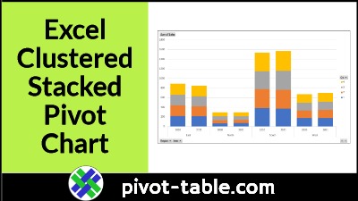
Easy Steps for Excel Clustered Stacked Pivot Chart
Excel doesn’t have a Cluster Stack chart type, but you can make a pivot chart with stacked columns that are grouped into “clusters”. See the steps in the video below, and get the sample Excel file, to try it for yourself. Continue reading “Easy Steps for Excel Clustered Stacked Pivot Chart”
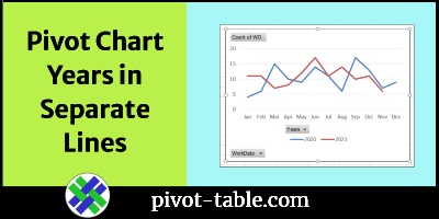
Show Years in Separate Lines in Excel Pivot Chart
If you make an Excel pivot chart to show monthly data, a line chart might have all the dates in a single line. This video shows how to group the dates, if needed, and how to show years in separate lines. It just takes a simple step – move the Years field to the pivot chart’s Legend (Series) area.
Continue reading “Show Years in Separate Lines in Excel Pivot Chart”
Change Pivot Chart Number Format Video
After you create a pivot chart, you can change the number format for axis labels. This video shows the steps. Change just the pivot chart, or change both the pivot table and pivot chart number format.
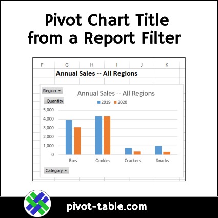
Get Pivot Chart Title from a Report Filter Cell
Instead of typing a pivot chart title, which never changes, use this method to create a dynamic heading. See how to create a formula on a worksheet, then link to that cell, to create a pivot chart title from a report filter cell.
Continue reading “Get Pivot Chart Title from a Report Filter Cell”
How to Fix a Pivot Chart All Columns One Color
After you create a pivot table, you can insert a pivot chart, based on that pivot table. In this example, the chart shows sales data, per city, over two years. See how to change the chart layout, after you build it.
Continue reading “How to Fix a Pivot Chart All Columns One Color”
Combo Column Line Pivot Chart in Excel 2013
Long ago, there was a Chart Wizard in Excel, and it had some built-in Combination Chart Types, like Column-Line. The Chart Wizard disappeared in Excel 2007, along with the combo chart type options.
Continue reading “Combo Column Line Pivot Chart in Excel 2013”
Compare Years in Pivot Chart
A pivot table is a quick and effective way to summarize data, and you can also create a pivot chart, to show a visual summary. And, if you’re summarizing the data by date, you’ll usually need to group the date field, to get a chart that’s easy to read.
Continue reading “Compare Years in Pivot Chart”
Create Pivot Chart from Data in Excel 2013
With a new feature in Excel 2013, you can create a pivot chart right from the source data – you don’t have to build a pivot table first.
Continue reading “Create Pivot Chart from Data in Excel 2013”


