After you create a pivot table, you can insert a pivot chart, based on that pivot table. In this example, the chart shows sales data, per city, over two years. See how to change the chart layout, after you build it.
Columns All One Colour
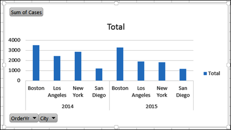
When you first insert a pivot chart, all the chart columns will be the same color, if there is only one series. The chart shown below is based on a pivot table that has Order Year and City in the Row area, and Cases in the Value area.

Change the Layout
If you want a chart with columns in different colours, the field layout will have to be changed.
NOTE: This will also change the layout of the pivot table on which the chart is based.
To move a field, follow these steps:
- Click on the Pivot Chart, to select it.
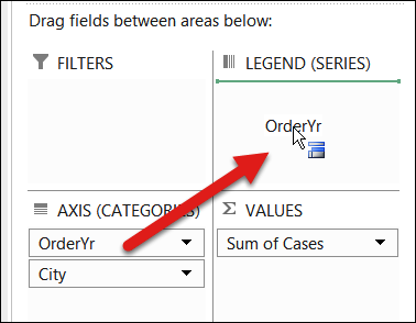
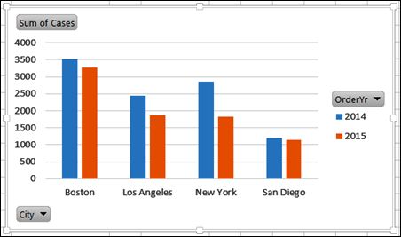
- In the PivotChart Fields window, drag a field from the Axis (Categories) box, to the Legend (Series) box.

That creates a series for each item in that field, and shows each series (each Year) in a different color.

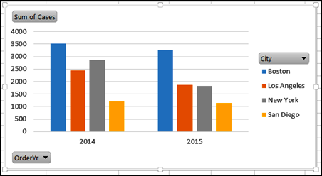
Or, you could leave the Year field in the Axis (Categories) box, and move the City field to the Legend (Series) box.
That will create columns with a different colour for each series (each City).

Get the Sample File
Visit the Pivot Chart page on my Contextures website to get the sample file.
Watch the Video
Watch this short video to see how to insert a pivot chart, and show the series in columns of different colours.
____________________
