Do you ever make a quick pivot table, then spend the next 30 minutes trying to make it look good? Here are three quick pivot table layout tips, to make your job a bit easier!
1) Make the Numbers Fit
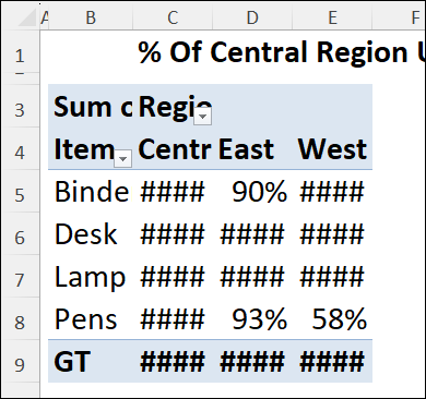
Last week, I increased the font size on a worksheet, and some of the pivot table numbers disappeared!
The larger font didn’t fit in the cells, so Excel showed number signs, instead of partial numbers.

Usually, I adjust a column’s width by double-clicking on its border in the column headings. That didn’t work well on this sheet though, because of the long headings at the top.
So, I used a quick trick to fit specific cells, instead of the entire column, and you can see the steps in this short video.
2) Hide Errors in Pivot Values
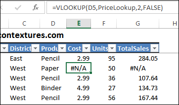
Sometimes, there are errors in an Excel pivot table source data, like #N/A errors shown below.
If you add those fields to the pivot table, the same errors will appear. That could make your data look questionable!

To make the pivot table look better, you can hide those error values, or change them to a different value.
I show the steps in this short video, so you can try different solutions in your own pivot tables.
3) Remove “Sum of” and “(blank”)
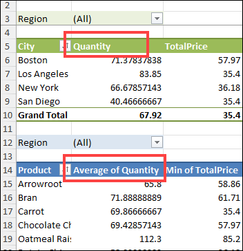
If you add fields to a pivot table’s value area, the field labels show the summary function and the field name. For example, when you add a field named Quantity, it appears as “Sum of Quantity”.
Excel won’t let you remove the “Sum of” in the label, and just leave the field name, Quantity. However, you can add a space character, at the beginning or end of the field name, to work around this limitation.

Also, if there are blank cells in the source data, you might see (blank) in the row labels. You can’t delete that text, but you can replace it with a space character.
In this short video, I show how to make those Pivot Table label changes, and there are more pivot table format tips on my Contextures site.
____________
Make Your Pivot Table Look Better – 3 Quick Tips
____________
asdasdf


2 thoughts on “Make Your Pivot Table Look Better – 3 Quick Tips”