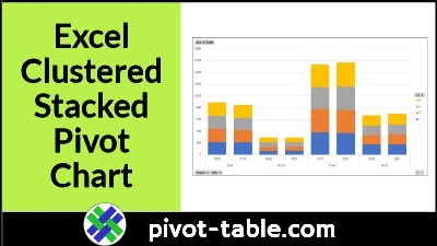
Excel doesn’t have a Cluster Stack chart type, but you can make a pivot chart with stacked columns that are grouped into “clusters”. See the steps in the video below, and get the sample Excel file, to try it for yourself.
Excel Clustered Stacked Chart
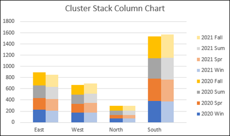
A cluster stack chart has clusters of columns or bars, with a stack in each column or bar.
For example, in the chart below, there are 8 stacks, organized in 4 clusters
- Cluster of columns for each Region, showing Year totals
- Stack in each Year column, showing sales per season
The Year stacks for each region are close together, and there are gaps between the regions, to separate the clusters.
Easy Steps – Clustered Stacked Pivot Chart
It takes a bit of effort to make a cluster stack chart, like the one shown above, and you can see all the steps on my Contextures site.
However, there’s a quick way to make one, by using a pivot table and pivot chart, and I use this method most of the time.
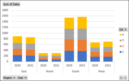
The Pivot Chart cluster stack version is slightly different from the previous chart.
- There is equal space between all the columns.
- The “cluster” effect is created by the region labels, and dividing lines, below the horizontal axis
If you’re fine with those differences, then use this pivot chart technique.
You can make a quick and easy cluster stack chart, like this one.
Video: Make Excel Clustered Stacked Pivot Chart
In this short video, you’ll see the steps for making a pivot table, and then a clustered stacked column pivot chart.
There are brief written steps below the video.
Source Data for Pivot Table
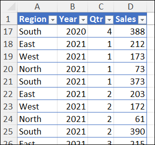
In the video example, there is sales data in a named Excel table.
The table has 4 columns: Region, Year, Qtr, Sales
Make Excel Clustered Stacked Pivot Chart
Using that Excel table with sales data, follow these quick steps, to create a cluster stack pivot chart.
- Create a pivot table, with fields for the chart’s horizontal axis in the Row area.
- Region and Year, in the video example
- Put field that you want to “stack” in the Column area.
- Quarter, in the video example
- Put the quantity field in the Values area
- Sales, in the video example
- Then, create a Stacked Column chart from the pivot table.
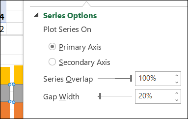
- Finally, set the gap width to about 20%, to make the columns wider.
Note: There are more details on the How to Make Excel Clustered Stacked Column Pivot Chart page on my Contextures site.
Get the Sample Excel File
For more details, and to get the sample Excel workbook, go to the How to Make Excel Clustered Stacked Column Pivot Chart page on my Contextures site.
The zipped sample files are all in xlsx format, and they don’t contain any macros.
For other ways to create this type of Excel chart, without a pivot table, go to the Cluster Stack Chart page on my Contextures site.
_________________
Easy Steps for Excel Clustered Stacked Pivot Chart
________________

