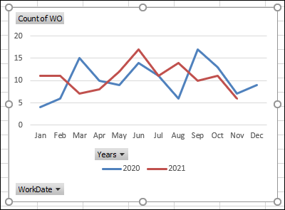
If you make an Excel pivot chart to show monthly data, a line chart might have all the dates in a single line. This video shows how to group the dates, if needed, and how to show years in separate lines. It just takes a simple step – move the Years field to the pivot chart’s Legend (Series) area.
Video: Show Years in Separate Lines
To see the steps for comparing monthly data, for 2 years, in an Excel pivot chart, watch this short video
The video timeline is below the video.
Video Timeline
- 00:00 Introduction
- 00:22 Work Orders Table
- 00:38 Create a Pivot Table
- 01:14 Add Fields to Pivot Table
- 01:19 Create a Pivot Chart
- 01:54 Group the Dates
- 02:24 Show Year Over Year
- 02:49 Final Touches to Chart
- 03:15 Get the Sample File
Key Steps to Show Years in Separate Lines
There are 2 key steps to follow, if you want to show monthly data for different years, in separate lines:
- group the dates by month and year
- move the year field to the Legend (Series) area of the pivot chart layout
These steps are outlined below, and there are more details on the Pivot Chart Compare Years page of my Contextures site.
Dates in the Pivot Table and Chart
When you create a pivot table and pivot chart, and add a date field, you might see:
- All the dates listed individually (as in the video)
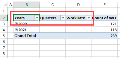
- Or, dates might be automatically grouped by Years, Quarters, and Months.
- You’ll see those new fields in the pivot table, in the pivot chart, and in the PivotChart field list.
Show Year and Month
For this pivot chart example, we want to see monthly data per year.
If your pivot table already has a Years field, follow these steps to show the months:
- If a Quarters field was added automatically, remove it from the layout
- In the pivot table (not the pivot chart), right-click on one of the Year numbers
- Point to the Expand/Collapse command
- Click on the Expand Entire Field command
Group by Year and Month
If your pivot table and pivot chart are showing individual dates, follow these steps to group by year and month:
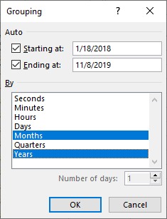
- In the pivot table (not the pivot chart), right-click on one of the dates
- Click the Group command
- In the Grouping window, the Starting at and Ending at boxes will show the first and last dates from the date field
- In the “By” list, click on Months and Years, then click OK
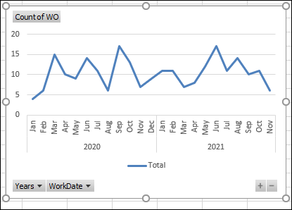
Line Chart with One Line
At first, the pivot chart will show all the data in a single line, with the years and months in chronological order.
To put each year in a separate line, follow these steps:
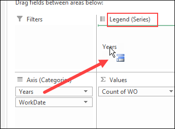
- Click on the pivot chart to select it
- In the PivotChart Fields List, drag the Years field into the Legend (Series) area.
The layouts for the pivot table and pivot chart will both change, and the chart shows each year in a separate line.
Get the Sample File
To get the sample file, and more details on this technique, go to the Pivot Chart Compare Years page of my Contextures site.
The sample file is in xlsx format, and does not contain any macros.
Also see how to compare sales year over year, by weekday, instead of calendar date. Add formulas and a pivot table, to compare weekdays in any fiscal week
____________________
Show Years in Separate Lines in Excel Pivot Chart
_________________________


