I’ve updated one of the pivot chart sample files on my Contextures website. On the main sheet, there are two pivot charts, showing survey responses by department, and by years of service.
At the top of the sheet, you can select a question from the dropdown list, and view the survey results for that question.

The Survey Responses
On the SurveyData sheet, there is a named table with the survey results. Each row contains one employee’s responses to the 5 survey questions, as well as their department and years of service. The green columns are used in the pivot tables and charts.
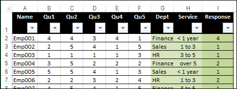
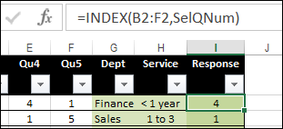
In the Response column, an INDEX formula returns the response for the selected question:
=INDEX(B2:F2,SelQNum)
The Pivot Table Sheets
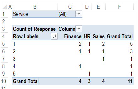
There are two charts, and each is based on a separate pivot table. Pivot1 has the Dept field in the Columns area, and Pivot2 has Service in the Columns area. Both have Response in the Rows area, and Count of Response in the Values area.
The Survey Lists Sheet
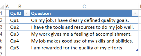
There is a list of questions, with a code and text description for each.
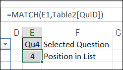
In cell E4, named SelQNum, an MATCH formula calculates the selected question’s position in the list.
=MATCH(E1,Table2[QuID])
Question Selection
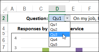
At the top of the SurveyCharts sheet, there is a drop down list in cell D2. The list is built with Data Validation, based on the list of questions, which is in a range named QuIDList.
IN cell E4, an INDEX formula shows the text for the selected question.
=INDEX(Table2[Question],SelQNum)

Add Code to Refresh the Charts
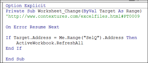
After you select a question from the drop down list, event code is triggered, and refreshes the pivot tables, to update the charts. If you don’t want to use macros, you could select a question, then click the Refresh All command on the Ribbon’s Data tab.
To see the code, right-click the SurveyCharts sheet tab, and click View Code.
Add Slicers To Filter Responses
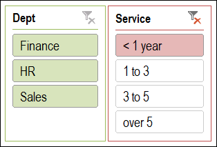
If you’re using Excel 2010, or later version, you can add Slicers to the pivot tables, and show them on the chart sheet. Then, select a department and/or years of service, to apply that filter to both charts.
Download the Sample File
To see the survey data, and experiment with the charts, you can download the sample file from my Contextures website. On the Sample Files page, go to the Pivot Tables section, and download the file from PT0009 – Survey Pivot Charts. The zipped file is in xlsm format, and contains macros. If you open the file in Excel 2007, you will see placeholders instead of the Slicers.
_______________
